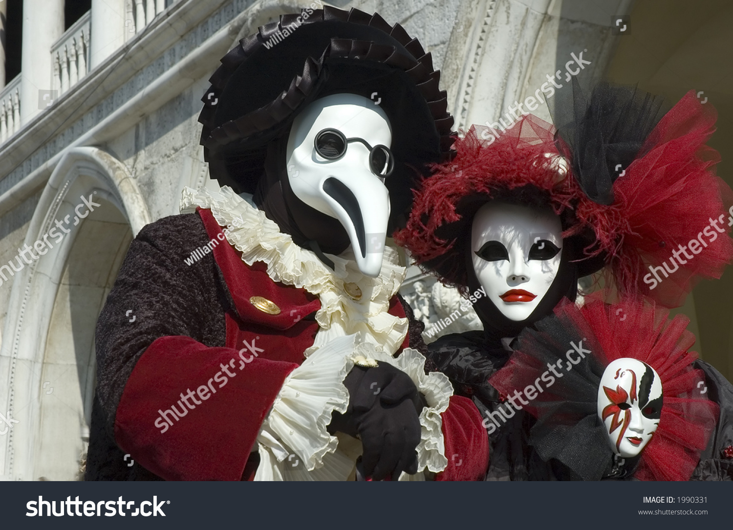
I really like how the mask on the left is shaped. It brings to mind the kind of mask a medieval period plague doctor would wear. The lack of bright colors also works very well with the design and makes it look better in the long run. The woman's mask on the right is also very interesting, if not a little creepy-looking. The monotone color scheme of the face and eyes really seems to make the red lips pop.

This second set of masks is also very eye-catching, albeit for different reasons than the first set. Both masks are cream colored with various blue and gold decorative patterns drawn on them. There also seem to be little blue gems placed in a few places on the masks. Whereas the first set of masks were cool because of their subtlety, these ones are cool for the exact opposite reason: they stick out. However, both fit right in with the Italian Carnivale.
Love the comparison to medieval period plague doctors. Didn't know what they were until I read this but you're so right!
ReplyDeleteAlso in reading some of your other blog posts, I realized you write poetically and use very eloquent words.
I love the theme of carnival masks, and I really appreciate that you wrote down your observation and thought. The carnival masks have a lot of potentials, hope to see them in your work!
ReplyDeleteThis entry is super RAD! i love the pictures you chose and the way you expressed your interest in them. It would be really cool if we could do a project making these kinds of masks. really great work!!!
ReplyDelete